Replicon
UX/UI Design and Visual Design System for Replicon
Overview
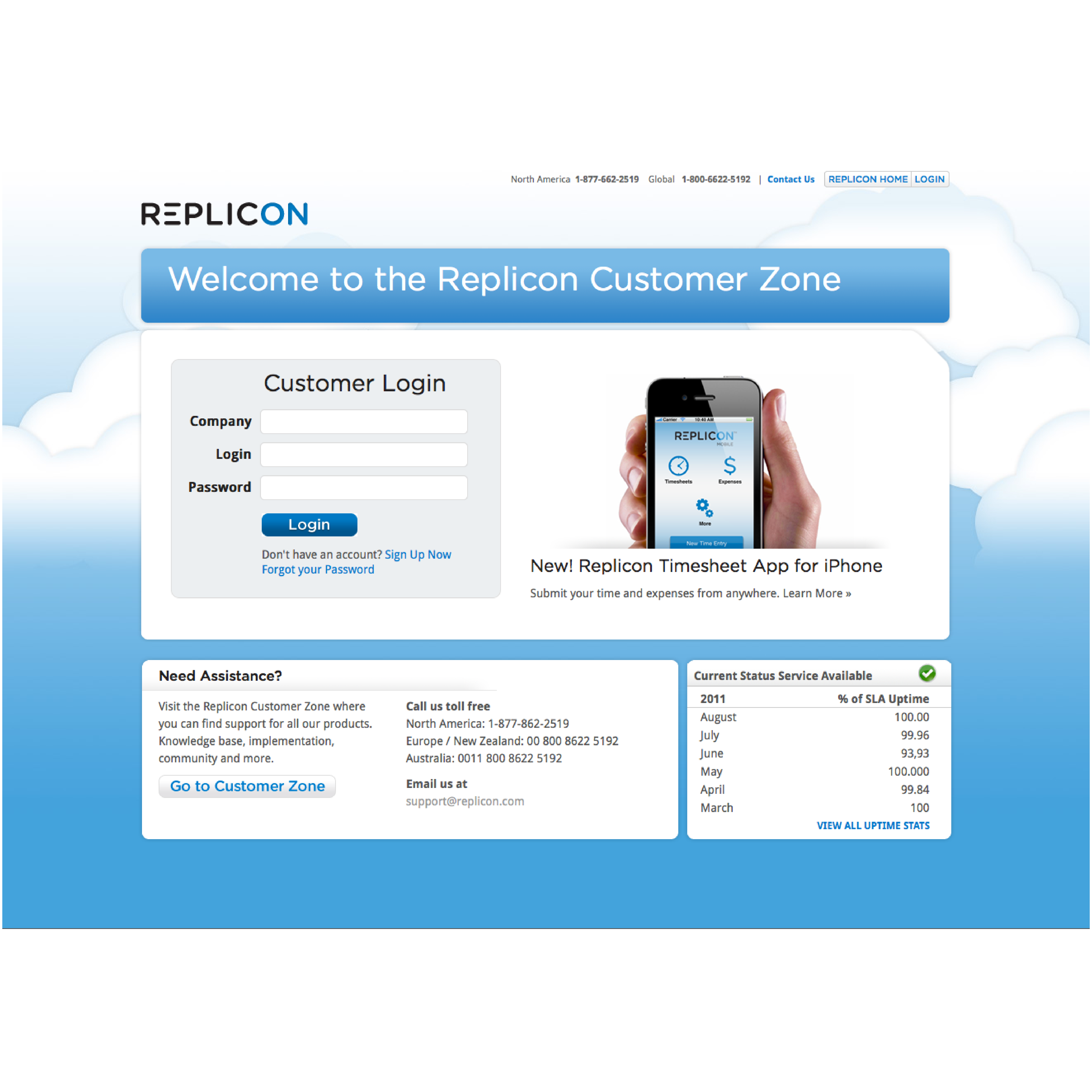
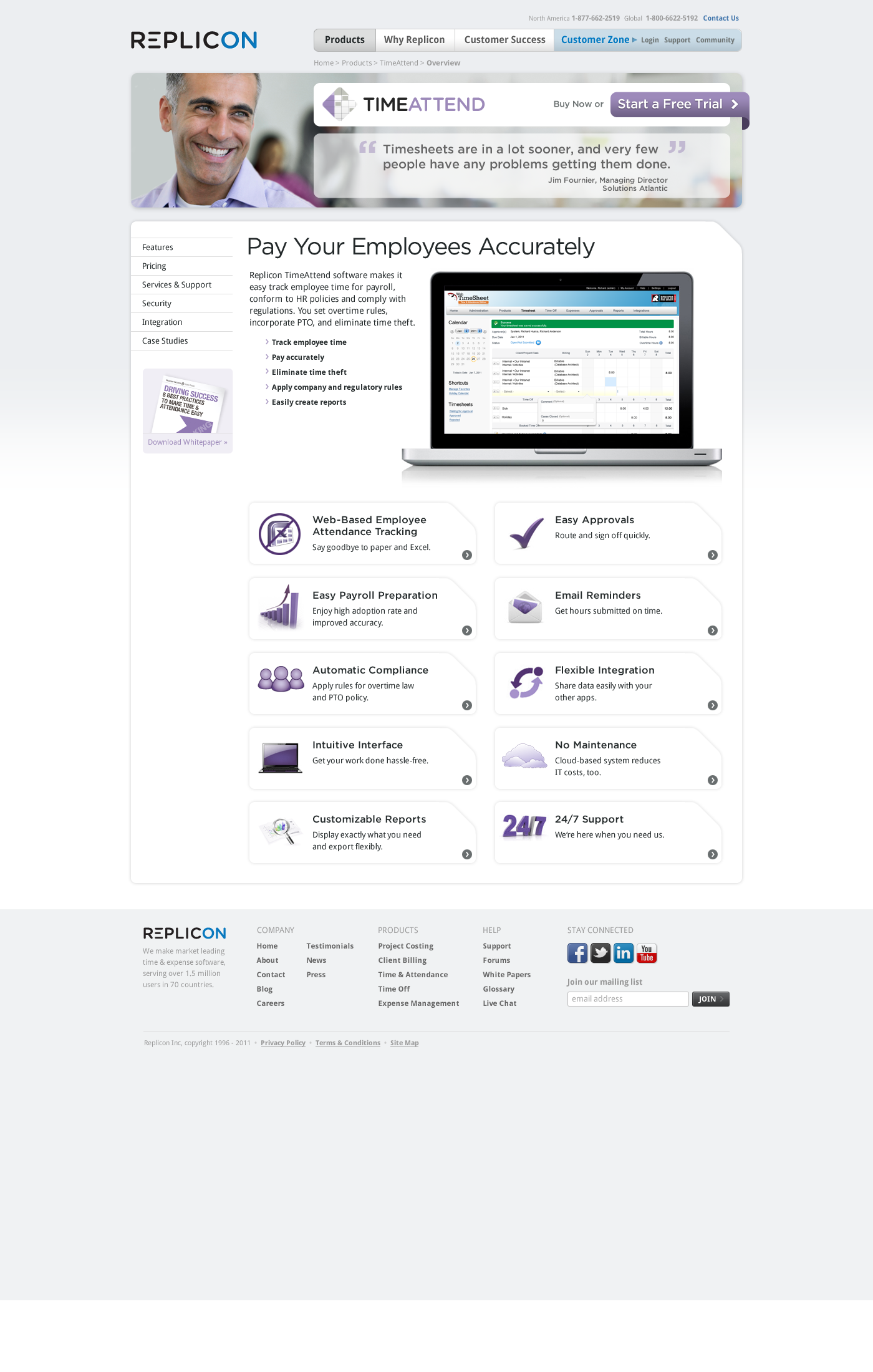
Replicon is an award-winning Time Intelligence platform offering enterprise solutions for time management, including time and attendance, client billing, and project tracking.
I was hired as Principal UX/UI Designer and Visual Design System Lead to establish Replicon's first UX/UI design practice and overhaul the product's user interface and brand identity. My role involved creating a modern, cohesive design across the product, and developing a visual design system that aligned with the SAAS architecture.
My Role
In this role, I functioned as a hands-on design leader, actively contributing to design tasks while guiding the overall visual design direction.
- Brand Direction: Shaping the visual identity and brand guidelines.
- UI Design: Collaborating with Co-CEOs, Engineering, Marketing, and Product managers to design an intuitive system based on best practices in user-centered design and design thinking.
- Interaction Design: Designing seamless user interactions.
Tools and Technologies
- Adobe Illustrator & Photoshop
- OmniOutliner
- Excel / Text Edit
Challenges & Outcome
The main challenges included establishing a consistent brand identity across platforms and integrating the new TimeClock product with the core Timesheet application.
The redesign resulted in a cohesive brand identity built on a strong design rationale foundation and the successful launch of a new TimeClock tablet device and iOS mobile app.
Additional Contributions
- Design Rationale and System Integration: Introduced best practices, created a semantic color palette and a comprehensive design system for visual feedback and consistency.
- Information Architecture: Continuously iterated to align taxonomy across the product ecosystem, brand system language, and marketing language.
Design Principles Applied
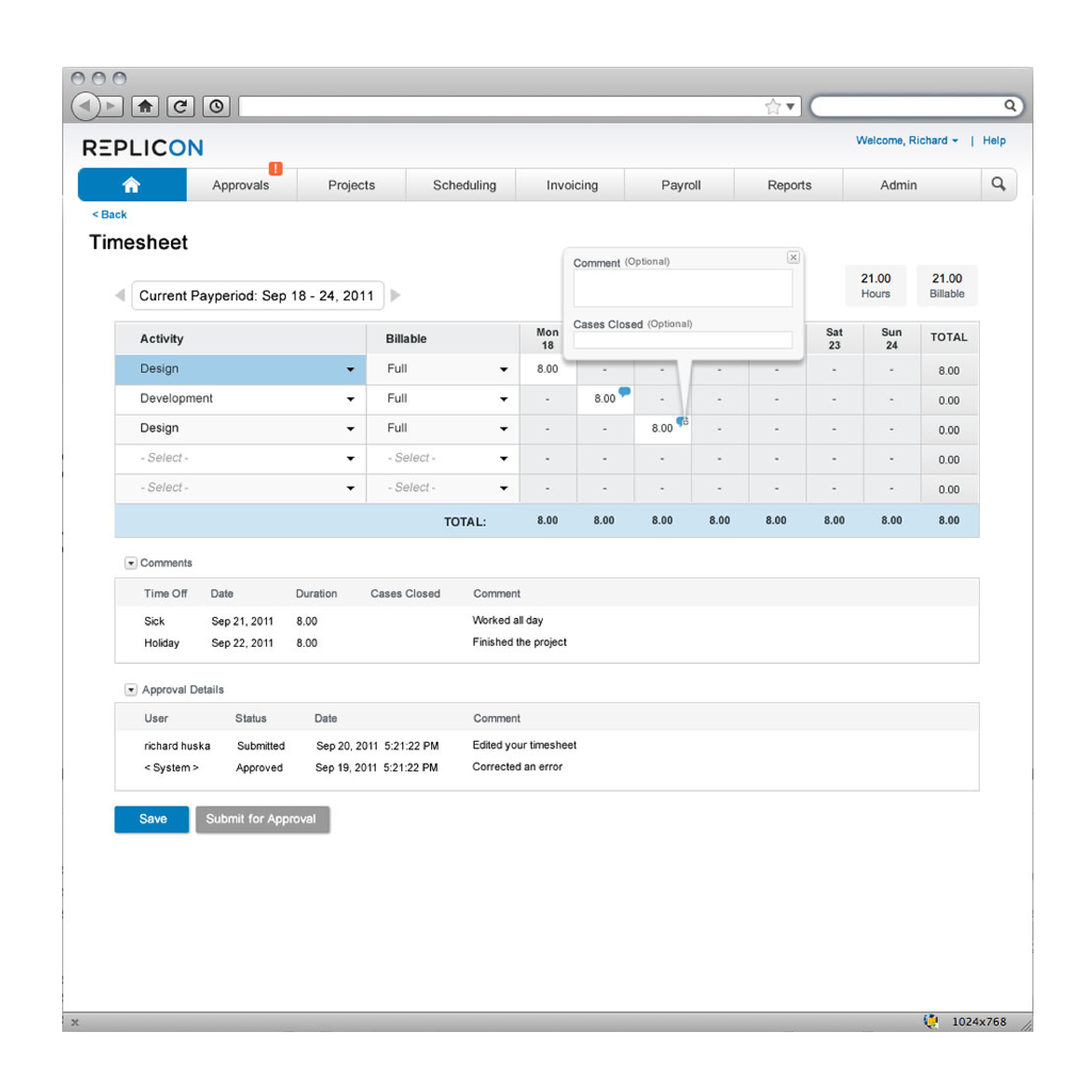
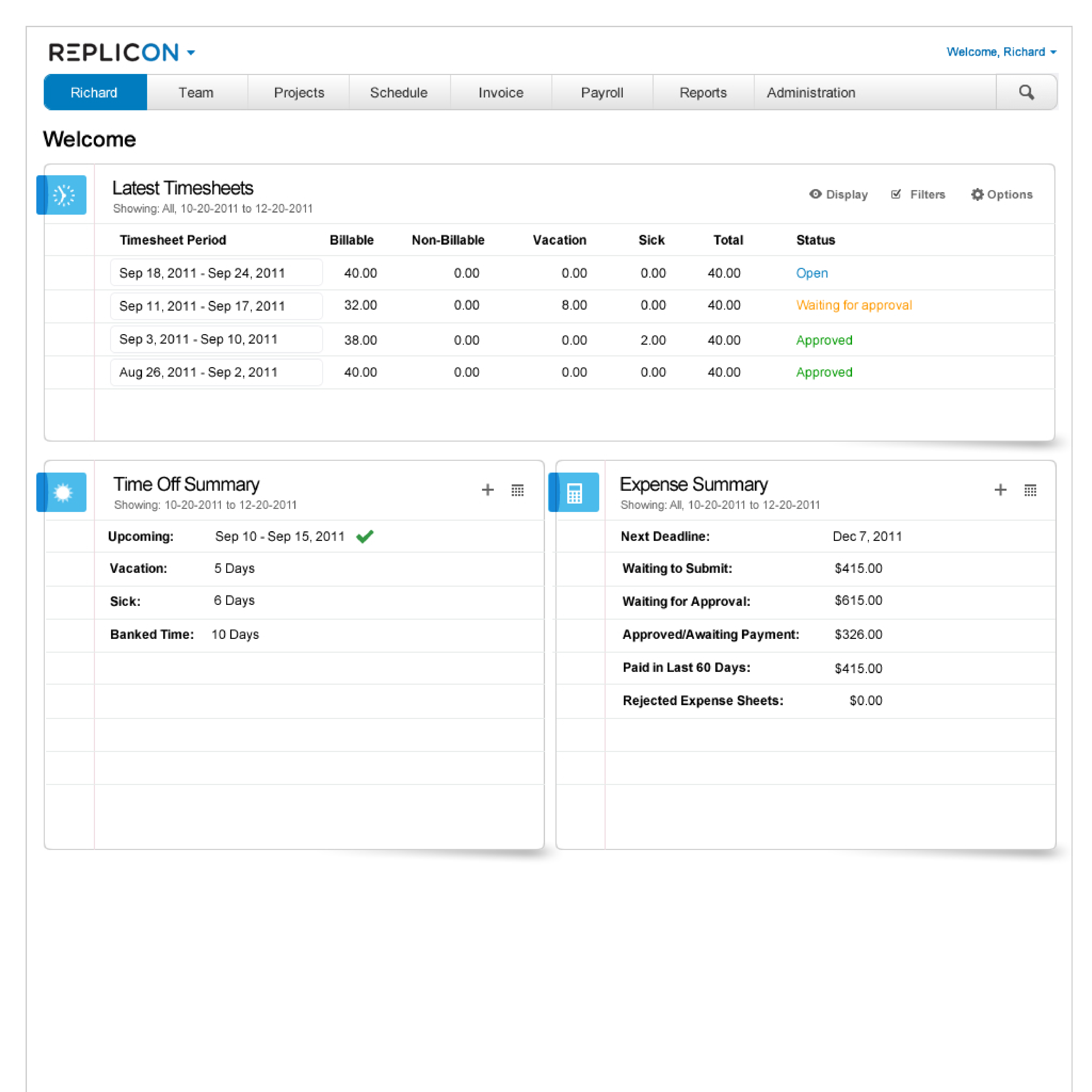
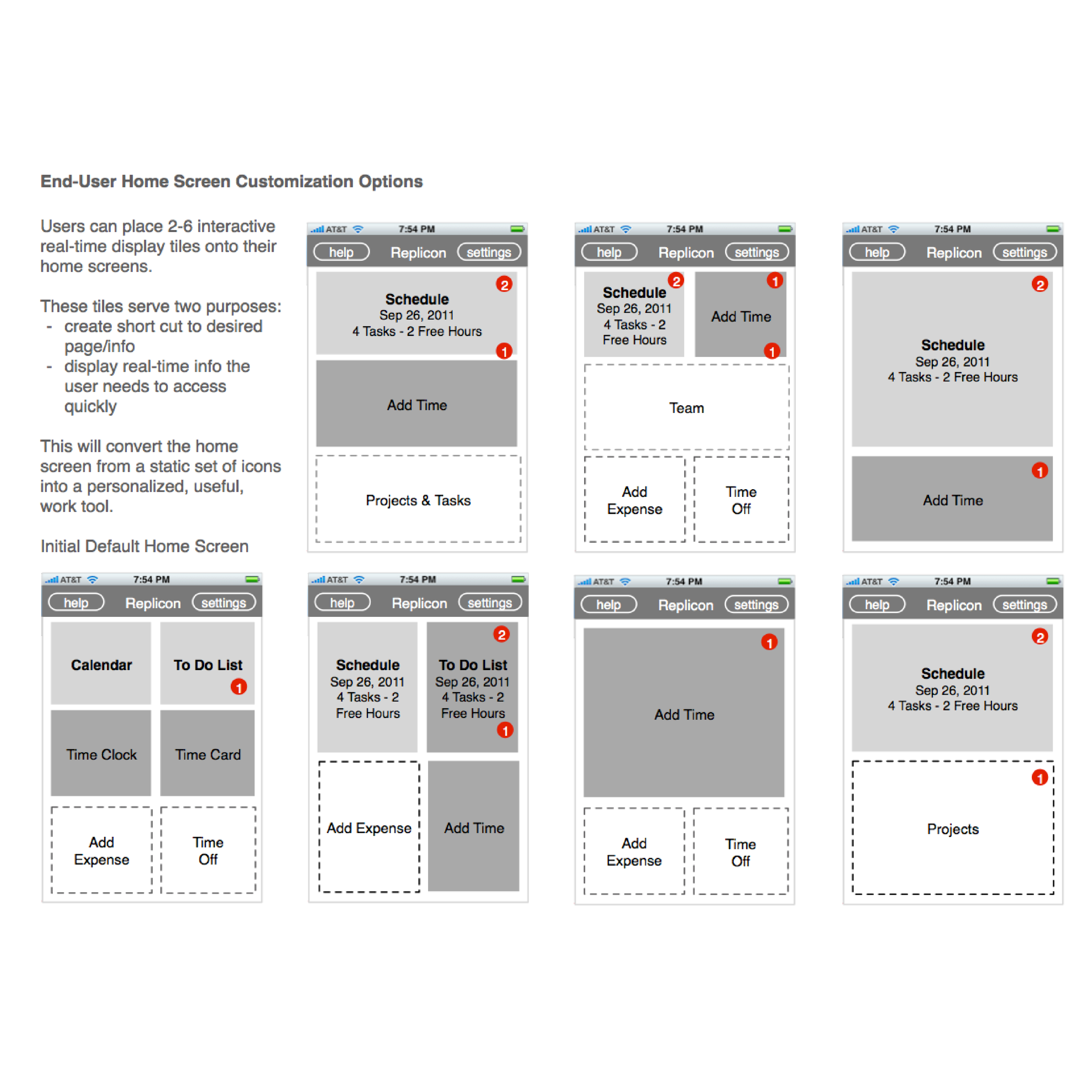
- Form Design: Ensured clear and efficient data entry through proper labeling, intuitive layouts, and appropriate use of form elements.
- Cognitive Load: Mapped information density to specific user preferences (e.g., Managers preferring comprehensive dashboard views).
- Visual Pacing: Arranged elements to guide the user's eye using whitespace, typography variations, and visual cues.
- Microconversational Design: Introduced the concept of the application as a conversation between the user and interface using clear microcopy.
- Semantic Color Palettes: Reserved specific colors for success (green), system messages (blue), warnings (yellow), and errors (red).
- Gestalt Principle of Closure: In designing the Replicon logo, I leveraged the human brain’s tendency to fill in gaps. By omitting parts of the letter, we created a unique mark that is more memorable and engaging.
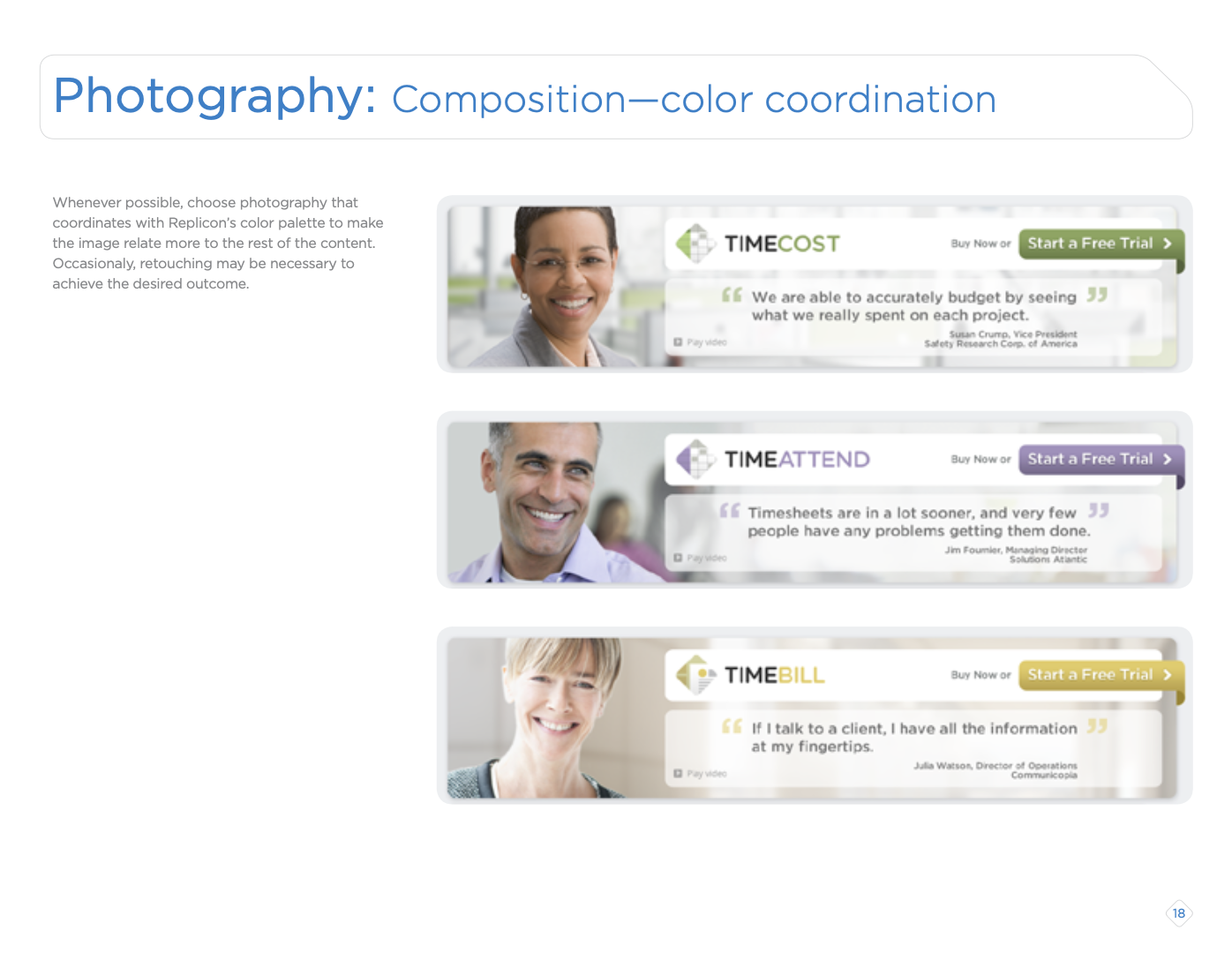
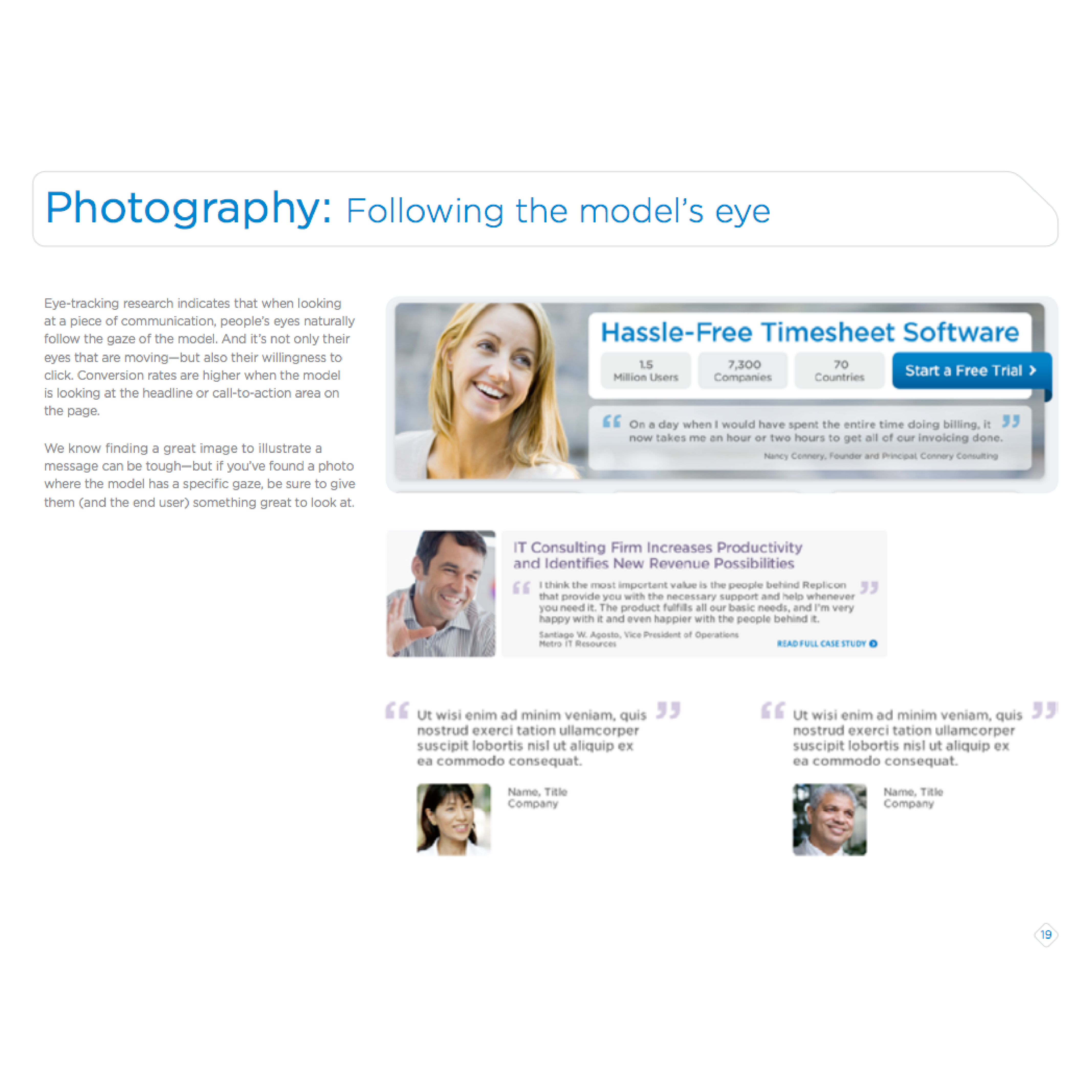
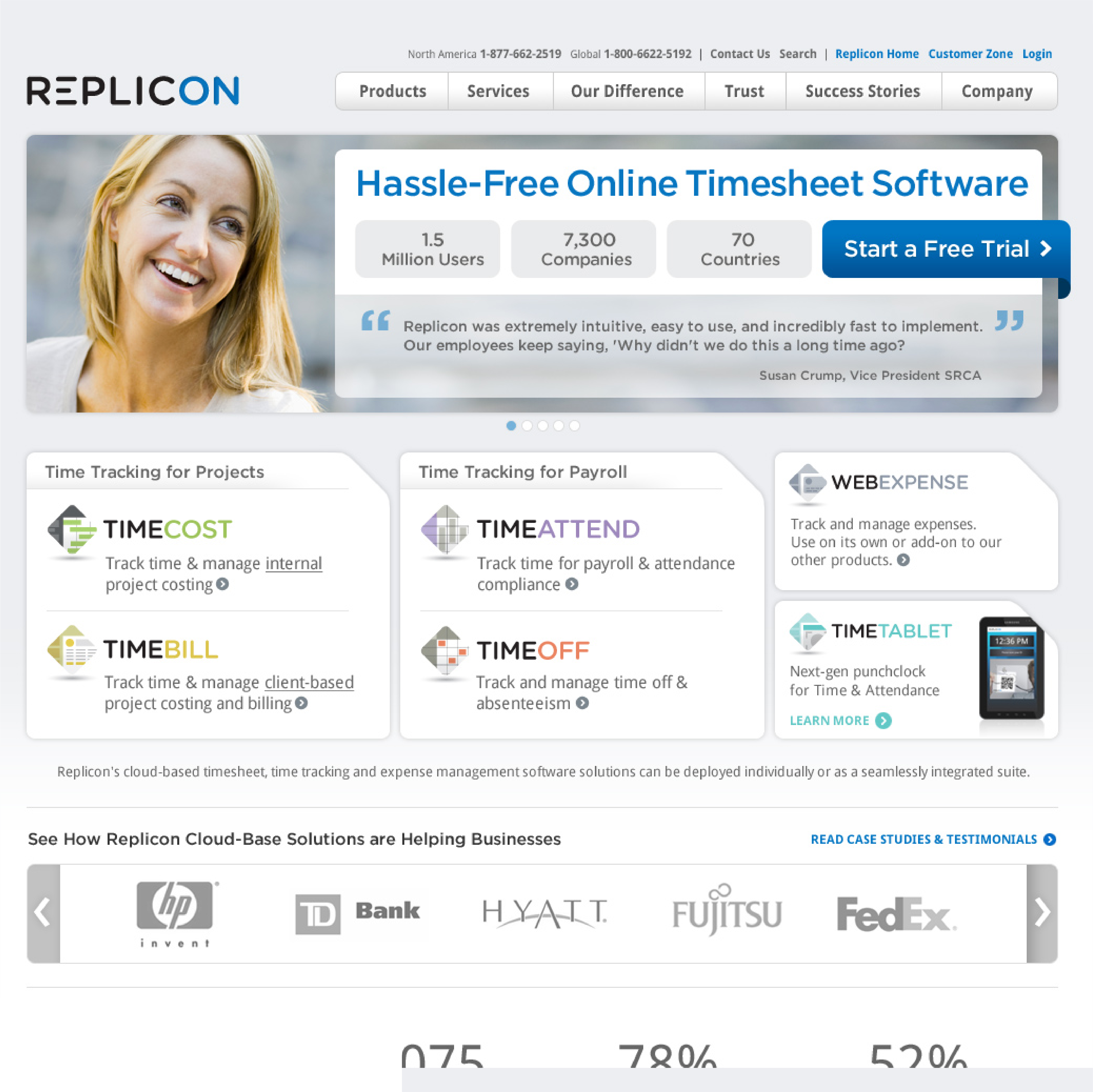
- Gaze Cueing: Strategically positioned model's gazes in brand photography to subtly guide viewer attention towards key headlines.
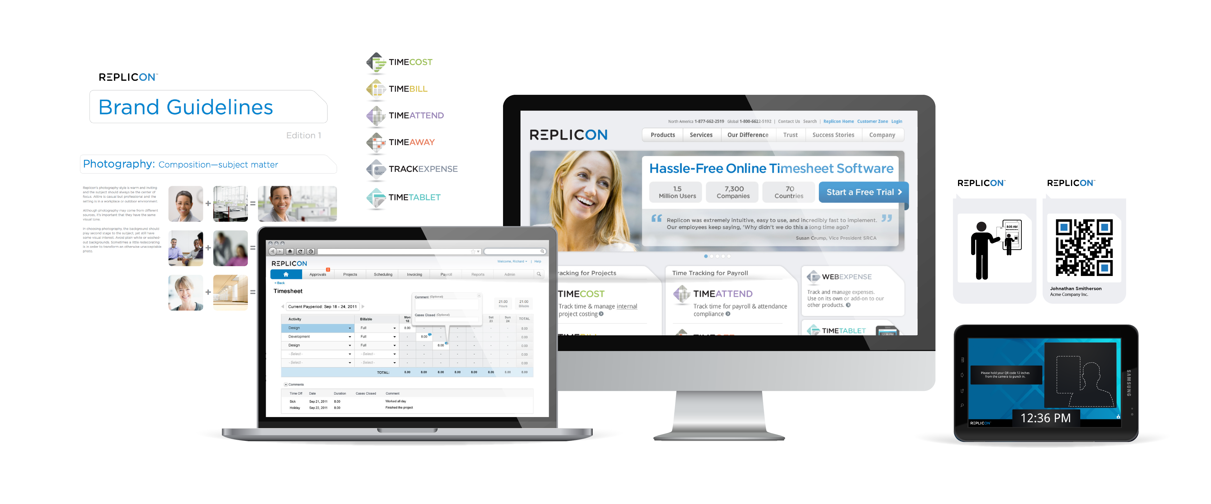
Replicon Brand Guidelines
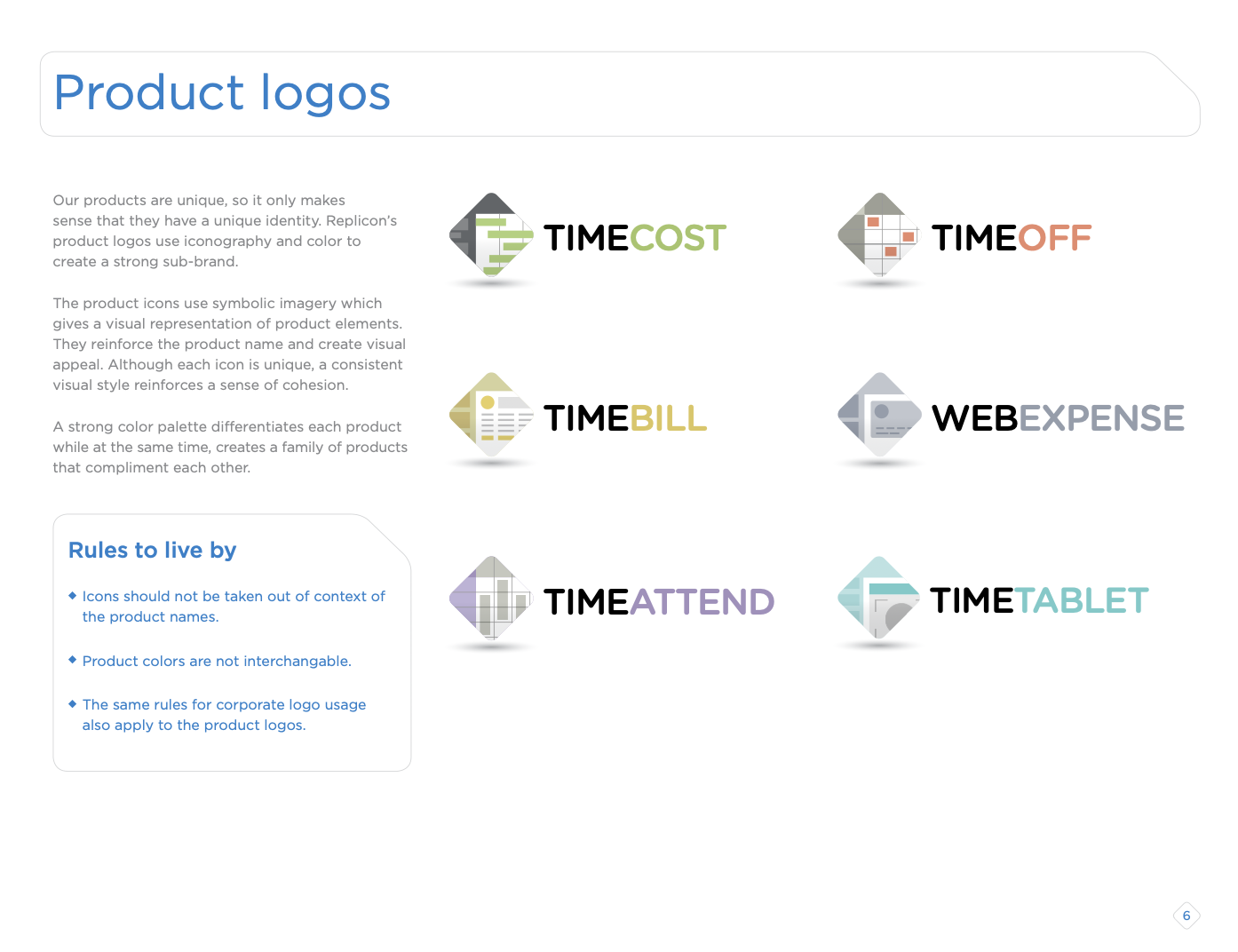
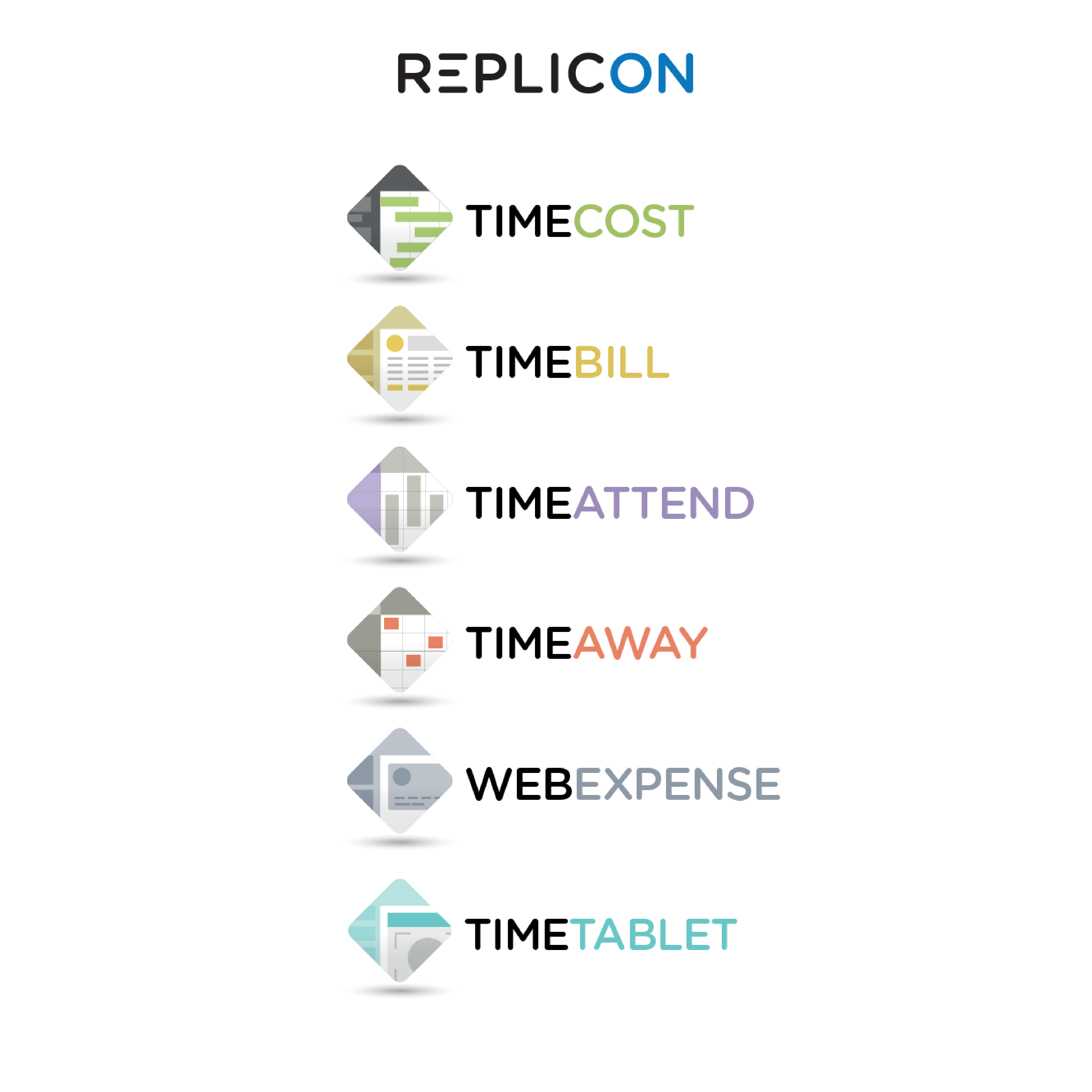
The identity system extended to each Replicon product, ensuring a cohesive brand extension through subsystem visual languages.
Photography Rationale
In the brand redesign, we incorporated gaze cueing to enhance visual hierarchy. By positioning models to look towards our key headlines, we leveraged natural human tendencies to follow others' eyes, drawing attention immediately to the most important message.
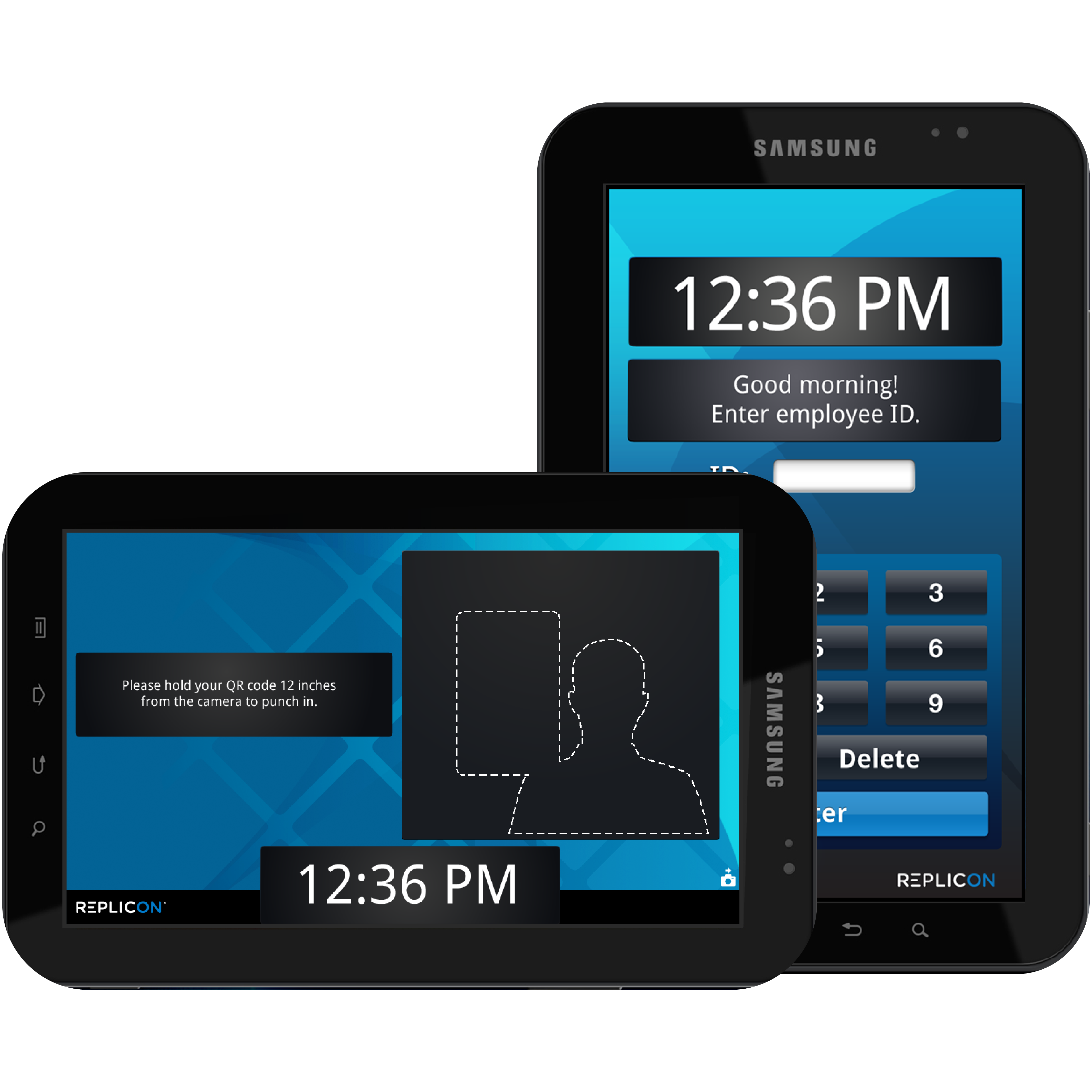
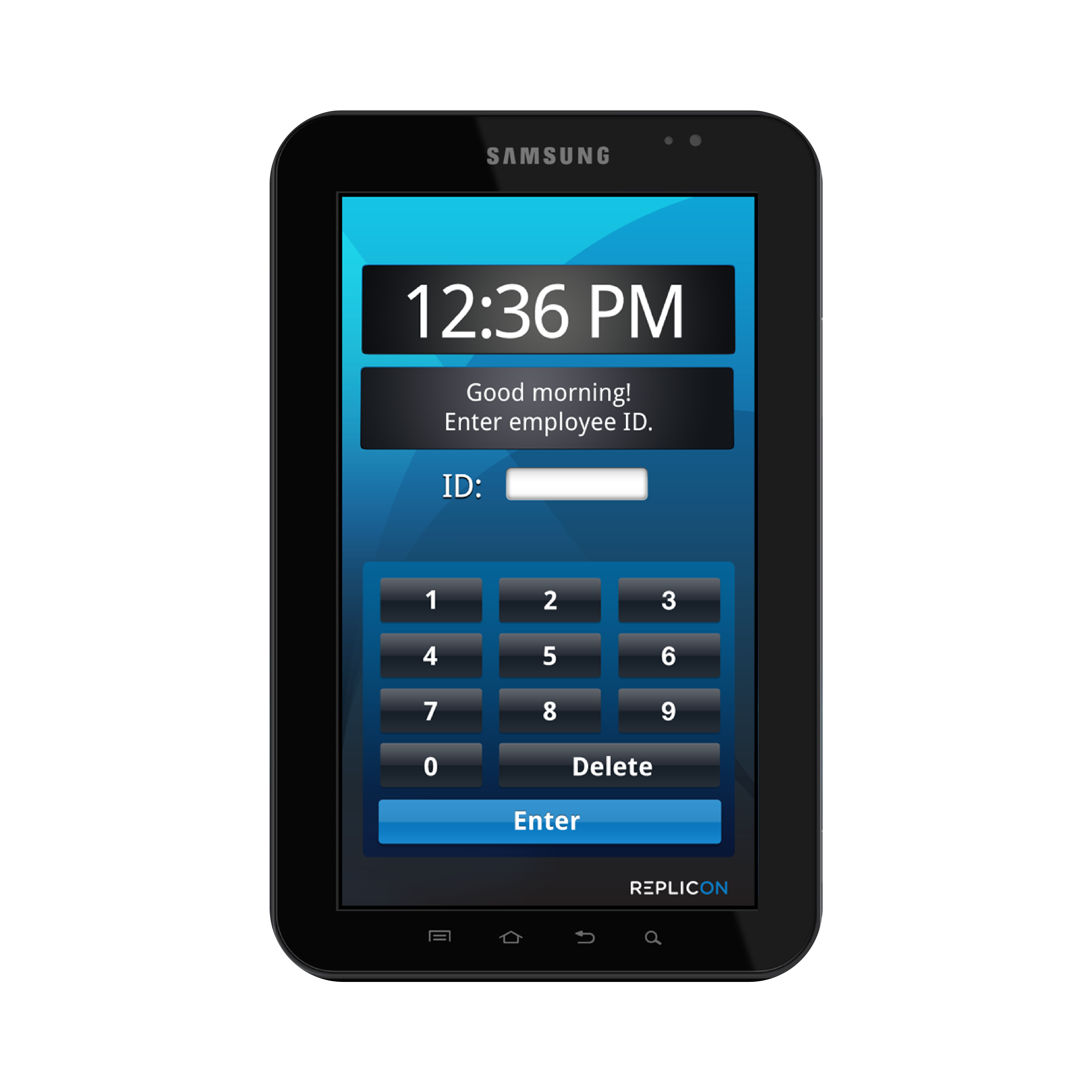
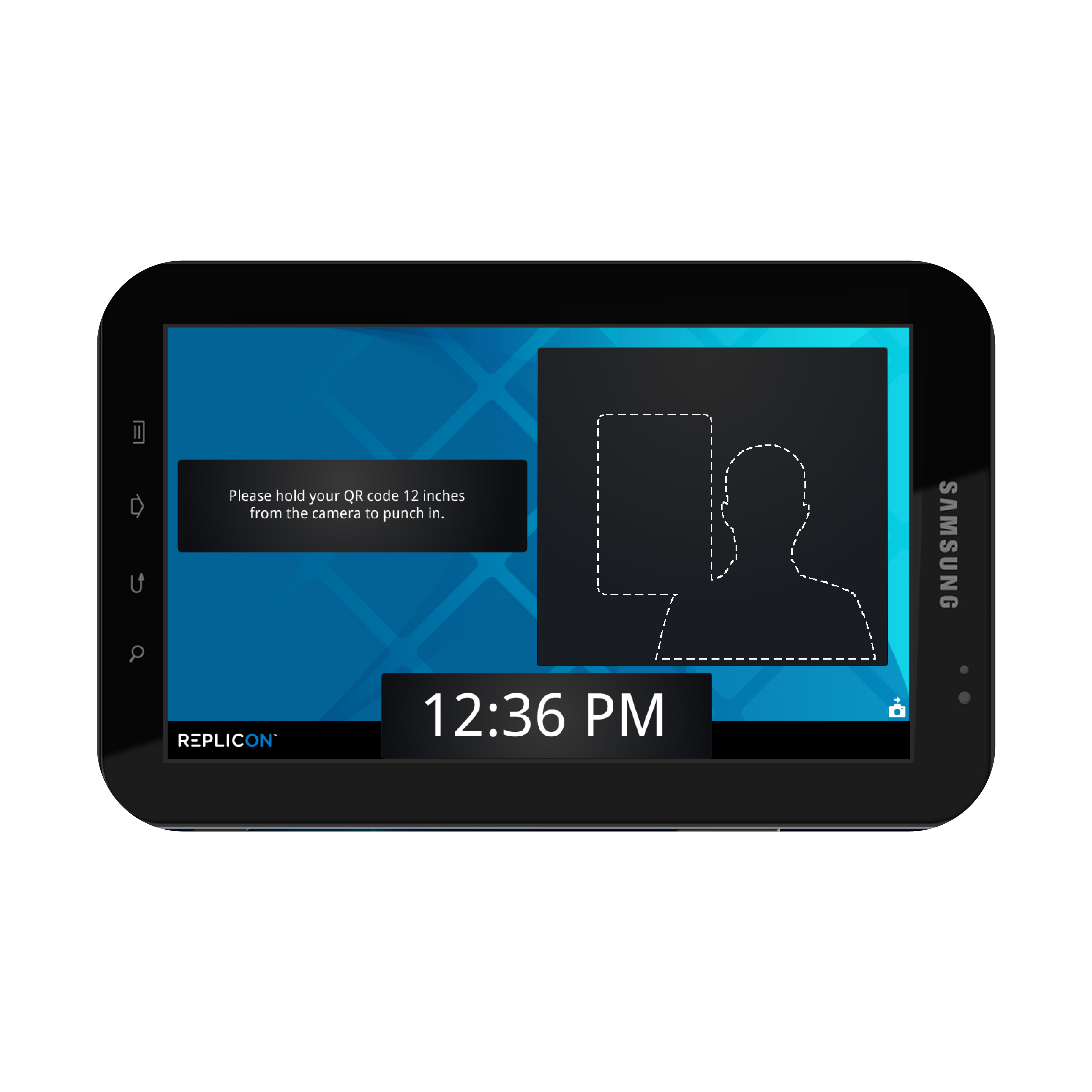
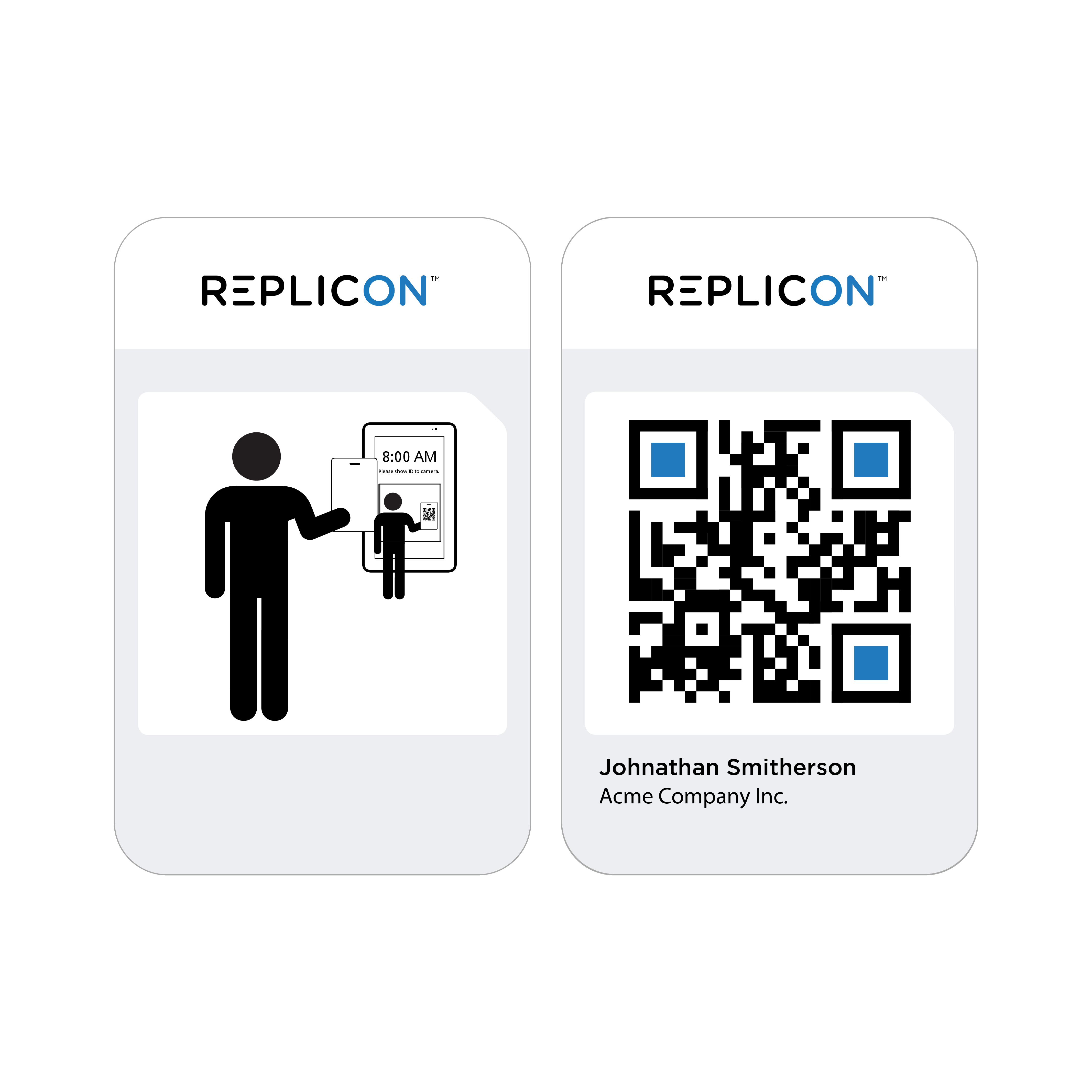
Replicon TimeClock
Designed a kiosk-style tablet UI in collaboration with PM and Engineering for secure attendance tracking. Integrated user feedback and best practices for Android and mobile UI design.
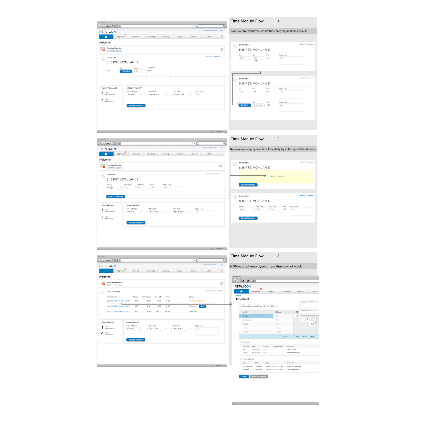
Artifacts & Wireframes